 Kiplinlen
Cyberpunk 2077 Font: What the Game Actually Uses
2 min read
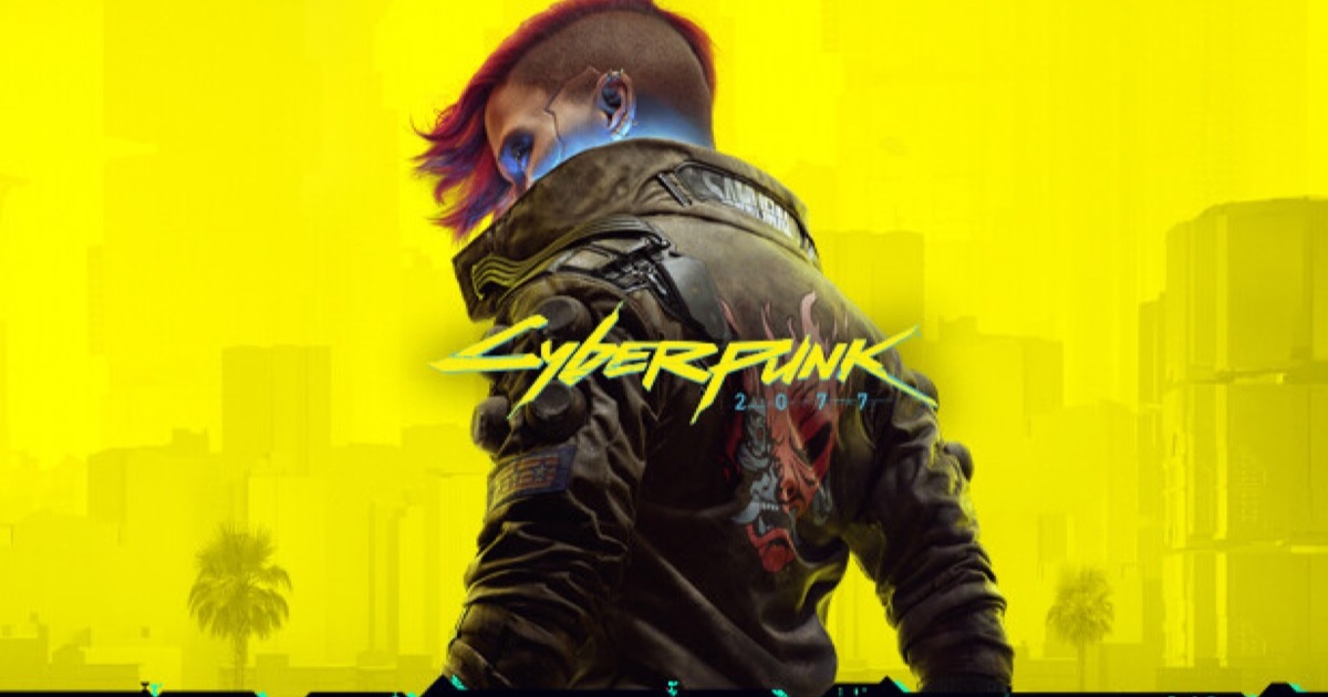
The interface font is a real typeface you can download. The logo is not — and that trips up everyone trying to recreate it.
The Cyberpunk 2077 font question has two different answers depending on whether you mean the interface or the logo.
The interface: Rajdhani
Almost the entire in-game UI is set in Rajdhani, across its Regular, Medium, SemiBold and Bold weights. It is a real, freely available typeface from the Indian Type Foundry, which describes it as technical and futuristic — squarish letterforms with flattened curves.
That is the one to download if you want menus, HUD text or a fan project that matches the game.
The secondary face: Orbitron
Orbitron appears on lower-priority text around the interface. It is a wider, more overtly sci-fi geometric face, and it is also free.
The logo: not a font
The wordmark is custom lettering, not a typeface. CD Projekt Red commissioned it to look hand sprayed onto a wall — sharp, slashing letterforms with diagonal cuts and deliberate digital noise baked into the glyphs, drawing on the lettering of Mike Pondsmith's original 1988 tabletop game.
Because it was drawn rather than typed, there is no download that produces it. The "Cyberpunk 2077 font" files circulating on free font sites are lookalikes built by fans, and they diverge on most letters.
Practical advice
For anything with body text, use Rajdhani. For a title that has to read as the game, use a fan wordmark and expect to hand-adjust it — or letter it yourself, the way the original was made.