 Kiplinlen
Red Dead Redemption 2 Font: What Rockstar Actually Uses
1 min read
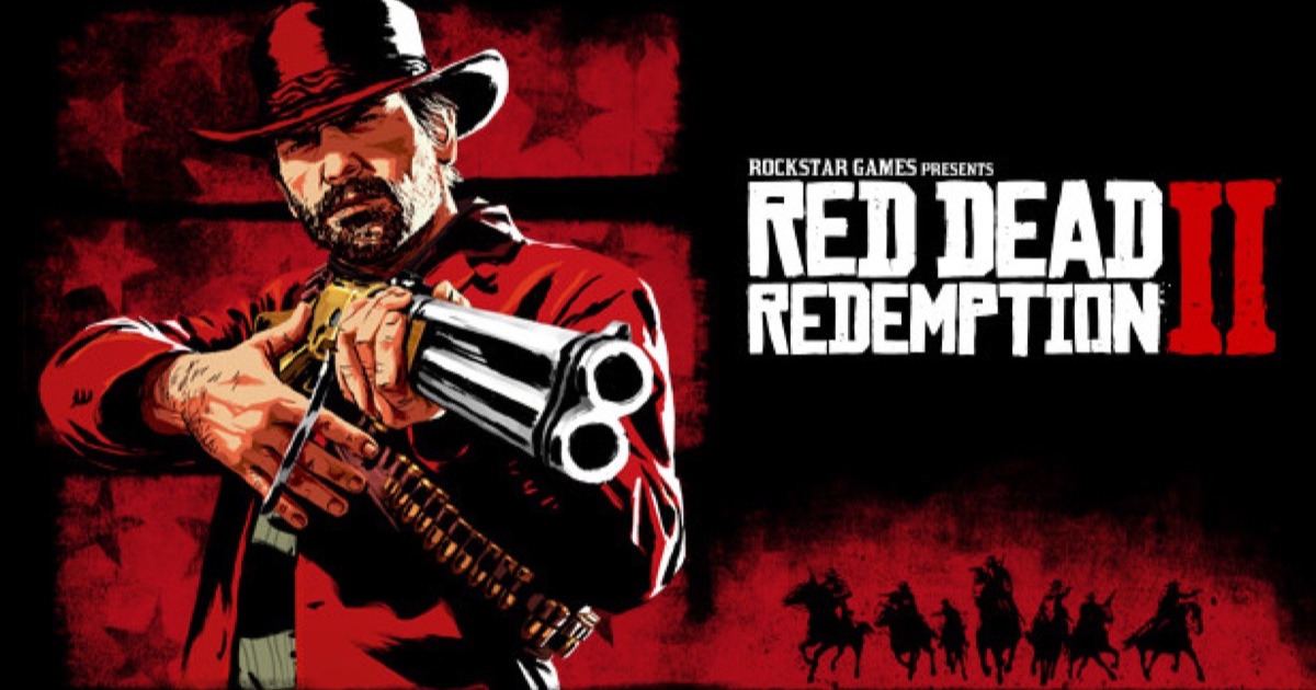
Rockstar has never named the typefaces in its logo or menus. Here is what the styles actually are and how to match them yourself.
There is no confirmed Red Dead Redemption 2 font name published by Rockstar or Take-Two. Game studios rarely license and disclose their branding fonts publicly, and this one is no exception.
What the logo actually looks like
The wordmark uses bold, slightly weathered lettering in the style of a hand-carved wanted poster — thick strokes, a worn edge, and none of the geometric cleanliness of a standard commercial typeface. It is designed to look printed on rough paper, not set digitally.
What the UI uses
Menus, subtitles and mission text use a plain, highly legible serif chosen for readability at a distance rather than period flavour. It is deliberately less stylised than the logo, because you are meant to read it quickly during gameplay.
How to actually match it
- Screenshot the logo or a menu heading directly from the game.
- Run it through a font-identification tool such as WhatFontIs or the Font Squirrel Matcherator, which compares shapes rather than relying on a guess.
- Treat any font pack sold online as "the RDR2 font" with scepticism — these are fan lookalikes, not licensed matches, and quality varies a lot between them.